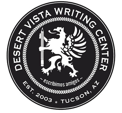
My friend Andrew is a graphic designer. A few months ago, I asked him if he would design a seal-like logo for the Writing Center. Here is result of our discussion.
Some thoughts on our logo:
1. The griffin was Andrew's doing, but I'm all in favor of griffins. They are my favorite mythological creature (I'm not making that up), and what could be better than a griffin holding a pencil. Write, griffin, write!
2. I wanted to make sure the year of establishment was on there because a) it's kind of what you do on a seal, and b) I am grateful to the people who came before me and decided that a Writing Center with a Writing Lab Specialist would be a good idea.3. Tucson is on there not only because we do what we do in the Old Pueblo, but because we want people to be proud of doing what they do in the Old Pueblo.
4. "Escribimos Amigos" isn't any kind of official motto, but it is fun to say. Say it. Go ahead. Say it under your breath if you have to (maybe you are at work and or in the library and you want to remain quiet out of respect for others). It means, "We write, friends" in Español. Also: it rhymes (sort of, depending on how loose you are with your definition of rhyming--I have a friend who adamantly denies the rhyming nature of "alligator" and "calculator").
5. We hope to eventually put this on shirts. A former student of mine has a screen-printing business, so it may pop up soon on someone's clothes.

No comments:
Post a Comment